
I led an in-house full rebrand for RCW, a pharmaceutical wholesale distributor that was currently targeting female-owned aesthetic clinics, and was shifting to a more corporate B2B client base.

Project summary
Stakeholders felt the brand no longer reflected its direction or level of professionalism.
I led brand strategy and visual identity redesign
Contributed to a 106% growth in revenue year on year after the rebrand, and internal staff reported high confidence using new assets
My contribution in this project
I led the brand strategy and visual identity redesign. I conducted discovery sessions with stakeholders to find out exactly the new type of customer we were positioning to, researched competitors and presented progress weekly, and presented 3 concepts to stakeholders. I defined the new brand logo, typography, colour system, brand guidelines etc - and redesigned all documents that are regularly used like letterheads, SOPs, order invoices etc.
The problem
RCW’s existing brand leaned heavily into pink tones and visual cues more suited to small, female owned aesthetic clinics. As the company began targeting larger, corporate clients, the brand no longer reflected its direction or level of professionalism. It needed to communicate scale and trust while staying grounded in the medical space.
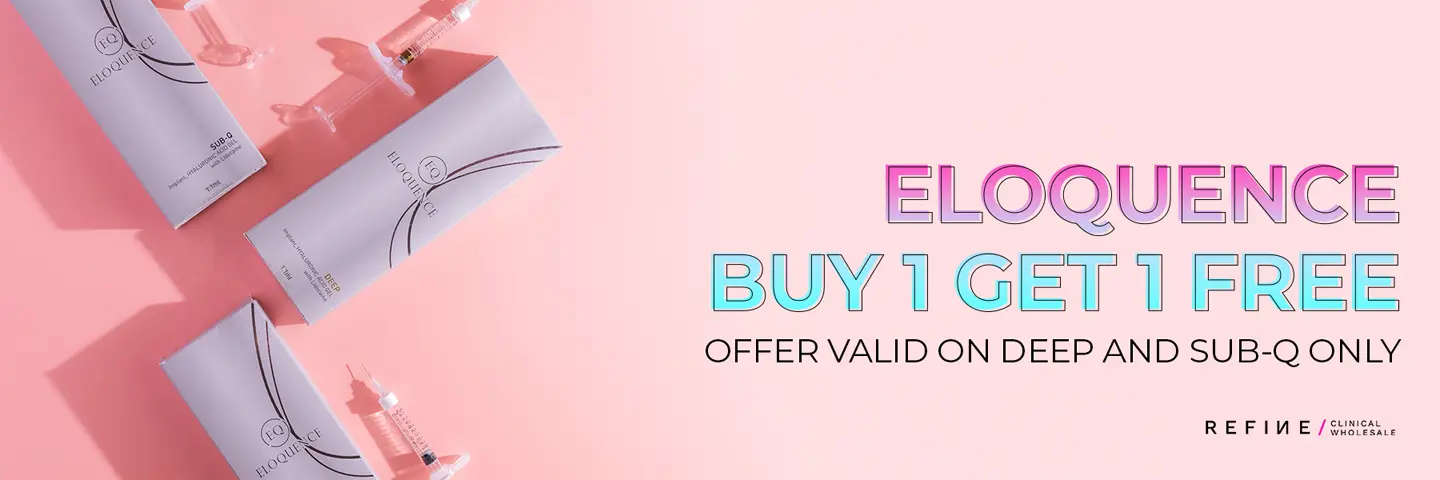
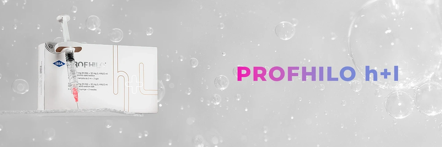
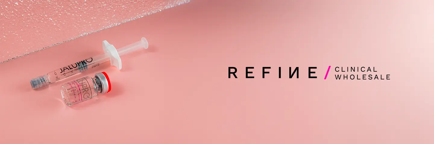
Some examples of previous branding. It's very product focused and uses pinks/whites with a blue/pink gradient to target female-owned aesthetic clinics.
Based on this, I set the project goals to:
Reposition the brand for a B2B/corporate audience
Replace soft, aesthetic-led visuals for a more corporate look and feel
Establish a visual identity that scales across print, digital, and packaging
Ensure internal alignment on goals and expectations before design began.
This kept the project on track, and make sure that I had something to reference back to stakeholders if the scope started to creep, or gave feedback that didn't align with the direction.
I researched the industry, competitors, and created two mood boards with distinct styles the identity could go down.
Before designing, I ran discovery sessions with internal stakeholders. These uncovered shared pain points - particularly misalignment on brand tone and unclear visual consistency.
Competitor research highlighted how most pharma suppliers used blues and clean sans-serifs to build trust. This influenced the direction we aligned on.
With stakeholder alignment on visual direction, I started designing.
Initial concepts explored the Refine ‘slash’ that was recognisable to existing clients. This was important to get right because we didn't want to alienate the larger clients we had already obtained. I also explored concepts with the Refine Pharma ‘plus’ icon.
The previous typeface (Montserrat) has a large x-height, ascenders and descenders, which does not typically suit a corporate identity: I explored traditional Grotesk typefaces like Akzidenz Grotesk, Neue Haas Grotesk and Helvetica.
I presented three directions:
An abstract plus logomark
A logomark incorporating both the Refine slash and a plus
A minimal slash in a container

All 3 concepts replaced the brand’s core pinks with a palette of blues and purples, to associate the brand with feelings of trust, reliability and safety. These were all words used frequently in earlier discovery sessions.
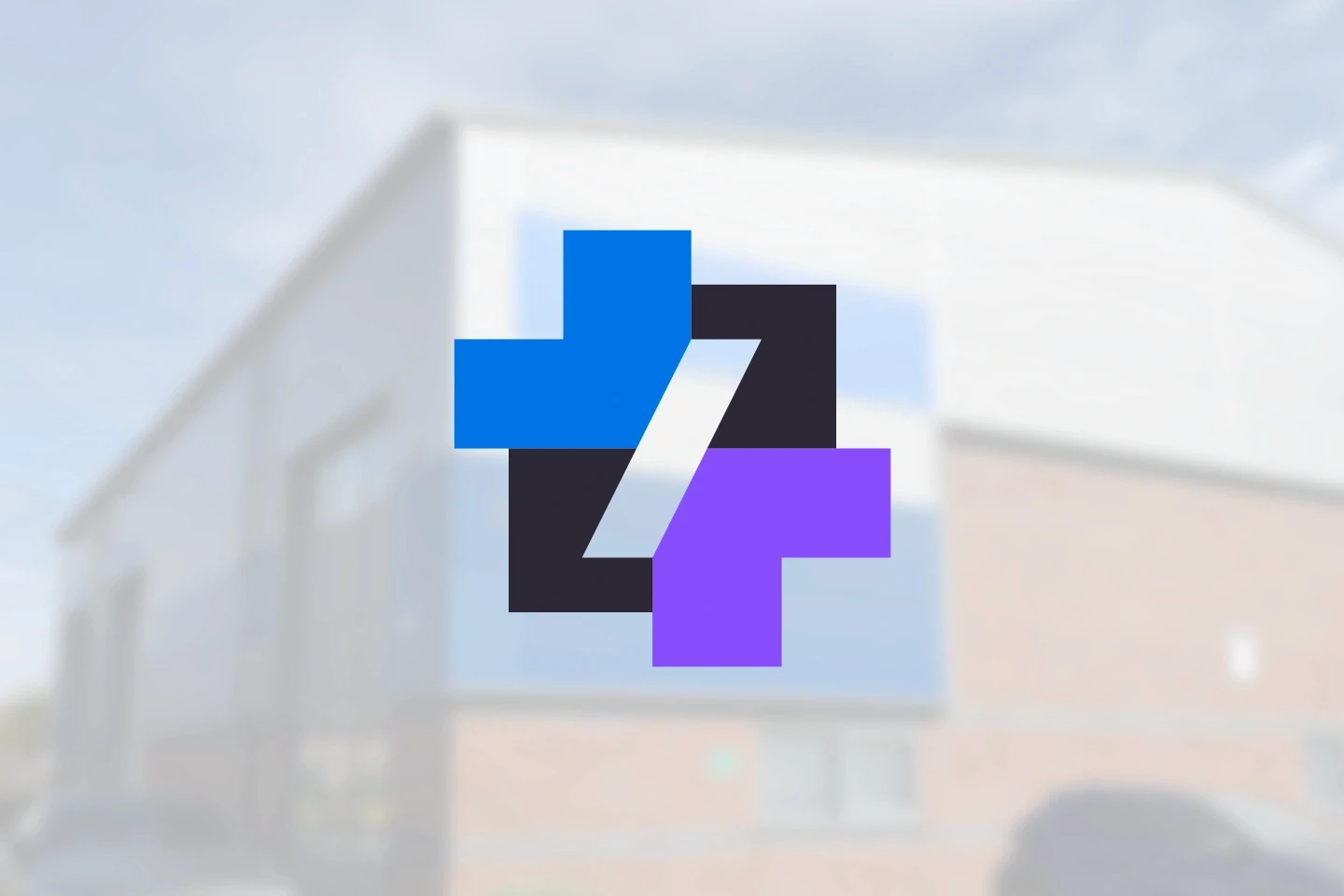
We chose to develop the 2nd concept further – stakeholders thought it looked the most unique, and they liked how it incorporated existing brand assets but used them in a new way. The typography shifted from Montserrat, a rounded sans serif font to a modern grotesk typeface for stronger clarity.
Final identity
The final deliverable included:
New logo and lockup system
Color palette and typographic hierarchy
Internal presentation templates
Social media and web design style guide
Brand guidelines document
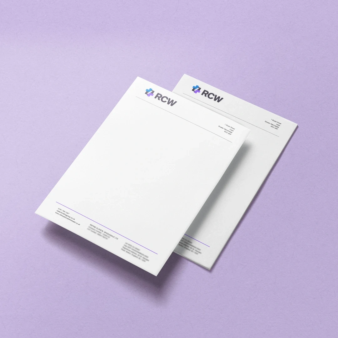
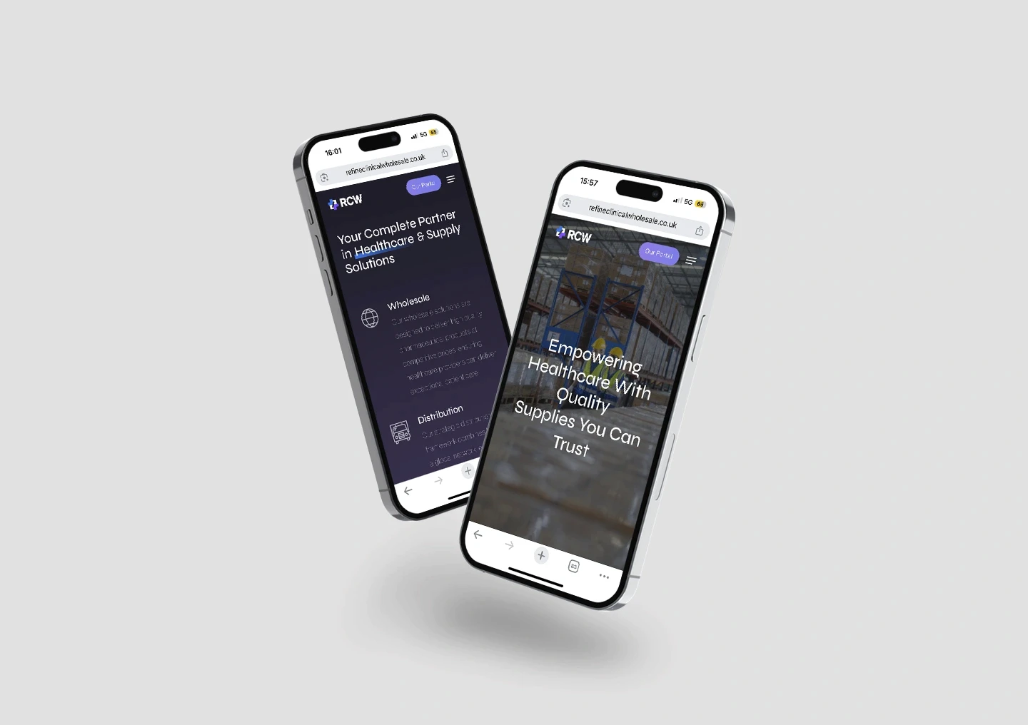
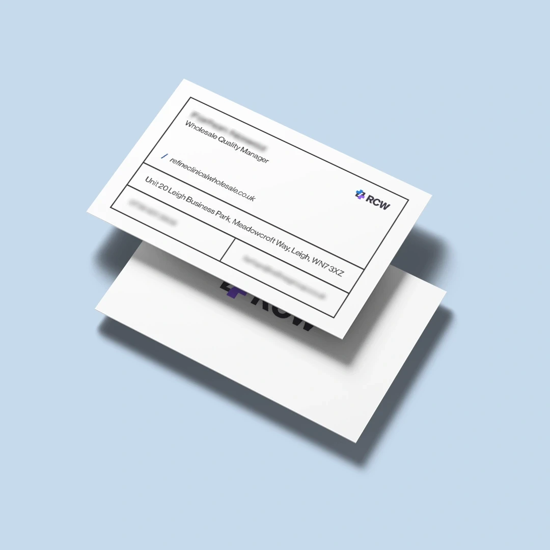
The project was a success. Results:
Contributed to a 106% growth in revenue year on year after the rebrand
Internal teams reported higher confidence using new visual assets
Positive feedback from new B2B clients on brand and professionalism
Reflecting on this project
This project showed me how powerful alignment with stakeholders is at the start. Spending time running at least one discovery session reduced rounds of revisions and also created buy-in across the team, since they felt part of the creative process. I now apply this approach as a foundation for any future identity work.