
I increased the amount of site registrations by 114% with a new, simpler registration flow.
Project summary
As a pharmaceutical supplier, our registration has a complex sign-up flow (which can’t be avoided due to industry regulation)
Redesign of registration resulted in a 114% increase in completed registrations over 90 days post launch
New clients comment to their account managers how easy our registration is compared to competitors
My contribution in this project
For this project, I analysed the current performance of our registration flow, validated the step that we thought was the most difficult with data from GA4, and redesigned it using Figma, which was then handed off to our dev team to implement.
Why did onboarding need to be more efficient?
To use the site, you have to be a medical professional - users have to prove this, which is done by asking for some identification and proof of their medical insurance. I found that there was a steep drop off at the document upload step - 88% of users would leave the flow at this step.

We was losing lots of users at the final hurdle, and didn’t even get to retain the data we had already received from the user in previous screens.
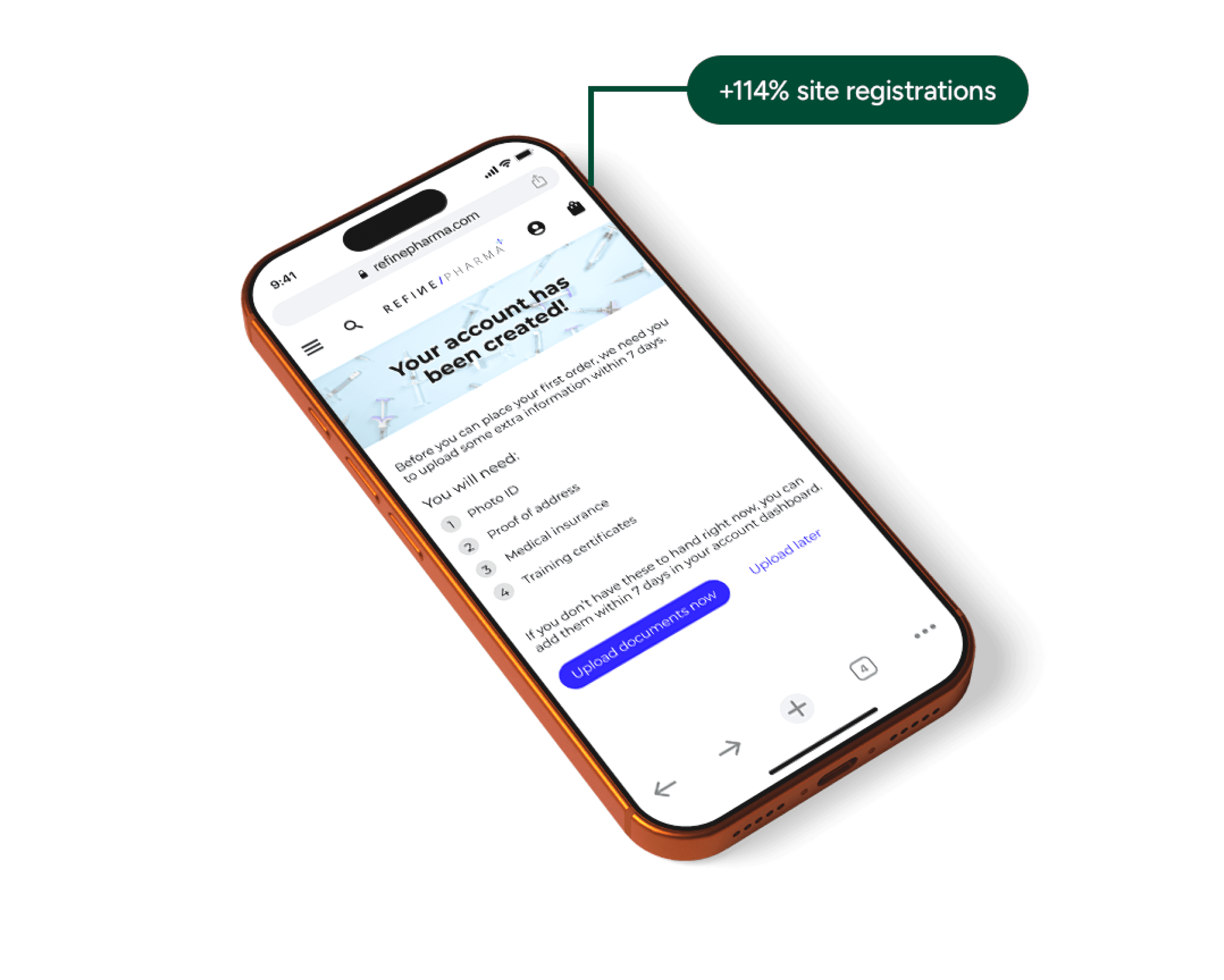
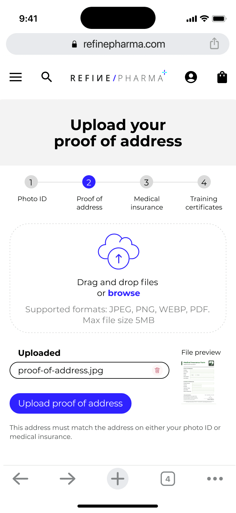
My solution separated standard registration form fields (name, email, phone number, password) and the document uploads. Since there was lots of friction at the document upload step, I also added a ‘upload documents later’ button, which meant the user could successfully register to the site without having the documents to hand, and add them in the account dashboard within 7 days.
I checked with development to make sure this was technically possible, and they had no concerns, so everything was looking good. As a secondary benefit, because we had their information already, if they didn’t get round to uploading the documents, our customer service team could contact them and help.
See the Figma prototype I presented to management below - this was approved with no changes, so I sent it straight to the dev team to implement.



Results
A 114% increase in completed registrations over 90 days post launch (this includes uploading documents!)
Average time to complete down from 1min 41s down to 45s (!!)
The sales team report new clients are commenting on how easy it was to sign up compared to the competition.
Reflection
Having good data as a starting point makes the design process much easier. I implemented a small change (an upload later button) but this meant hundreds of users completed registrations that otherwise would have bounced and gone to a competitor.
Looking back, this project felt risky - we didn’t do any design research in the company at this time, so I wasn’t able to test it with real users. Management were not very receptive to doing research due to the perceived time cost, so I took the approach that we could go back to the previous version if it performed worse. I closely monitored the GA4 analytics post launch to ensure it was working as intended, and thankfully it was (time to complete and complete rate both improved dramatically), but it could have gone the other way, and we would have been back to square one with a fairly big time investment on a solution that didn’t work.
I’ve since been advocating for data-driven design within the company, and while there is still room to grow, we have done more research in this past 3 months than the rest of the companies existence, which is very positive!