
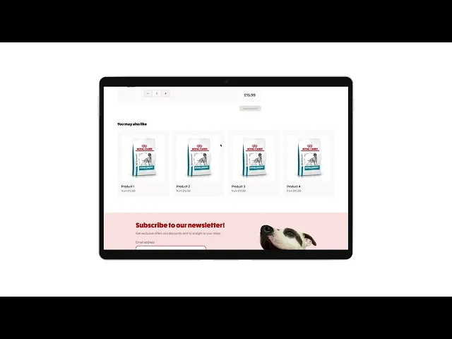
0 to v1 of a new pet medication website
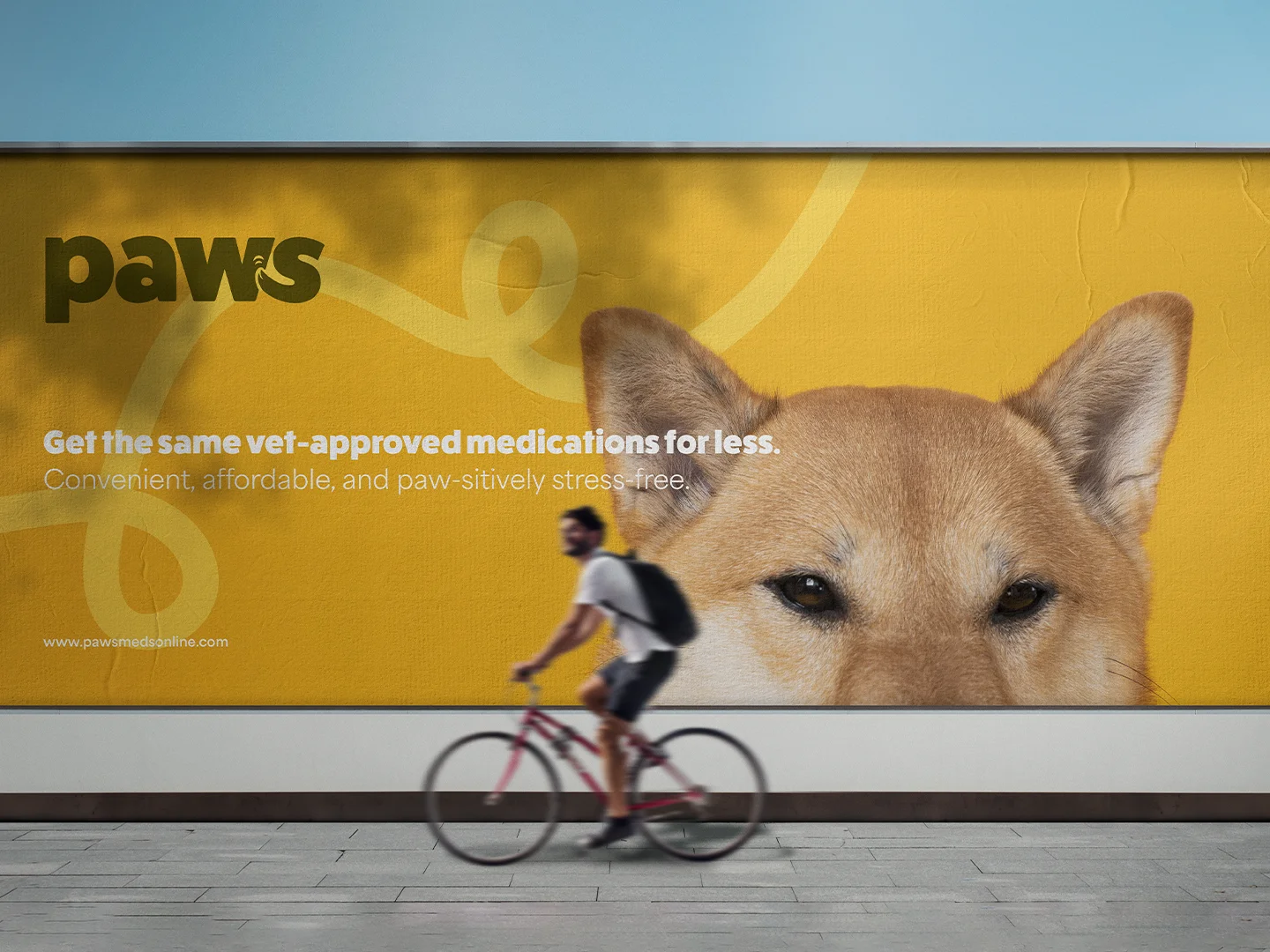
I created the brand identity, design system, key customer journeys and a website prototype in Figma, collaborating with the lead veterinarian and our developer.
Project summary
I learnt that taking extra time at the start to create a basic design system was super valuable.
The design system easily kept all screens consistent, even when the project got put on hold for 6 months
Our developer had a much easier time with my Figma files, since design patterns and components were re-usable
Stakeholders commented on how consistent the prototypes I designed felt to use
Designing the brand identity
This took 3 weeks to complete from the briefing to sign-off. I started by conducting a discovery session with stakeholders to define the scope of the project, target audience, USP, and how they wanted it to 'feel'
I audited competitors, shared my analysis with stakeholders, and created two moodboards with different visual directions to go down
I created 3 brand identity concepts, which I ultimately presented to the entire company for feedback.
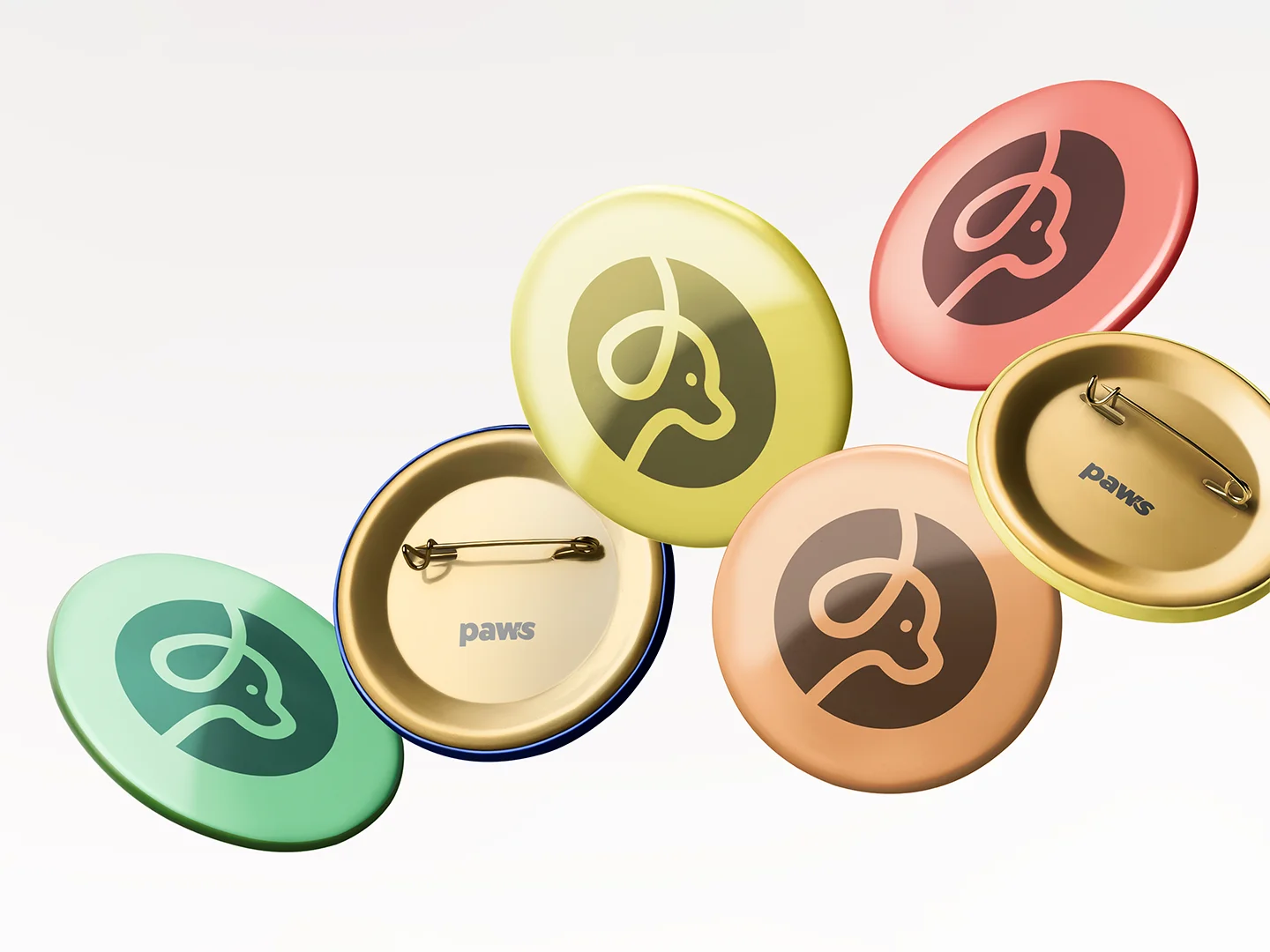
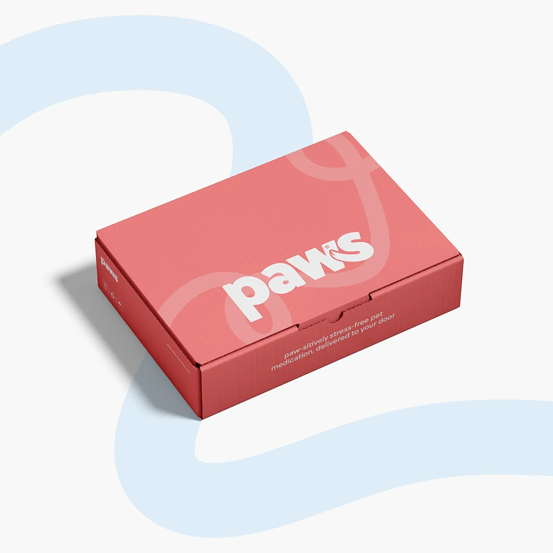
After 1 minor round of revisions (small adjustments to the tail in the logo), we had a brand ready to launch that would resonate with the people who we wanted to buy from us.
Creating the design system and website prototype!
Since this was going to be quite a big project, I created a basic design system that would keep the website consistent. It would save me time when designing and also standardise decisions to make it easier for our developer to understand.
I created:
Basic design token system (colours, typography, spacing etc)
Key UI components (buttons, checkboxes, form fields, product cards etc)
Validating the design system before continuing
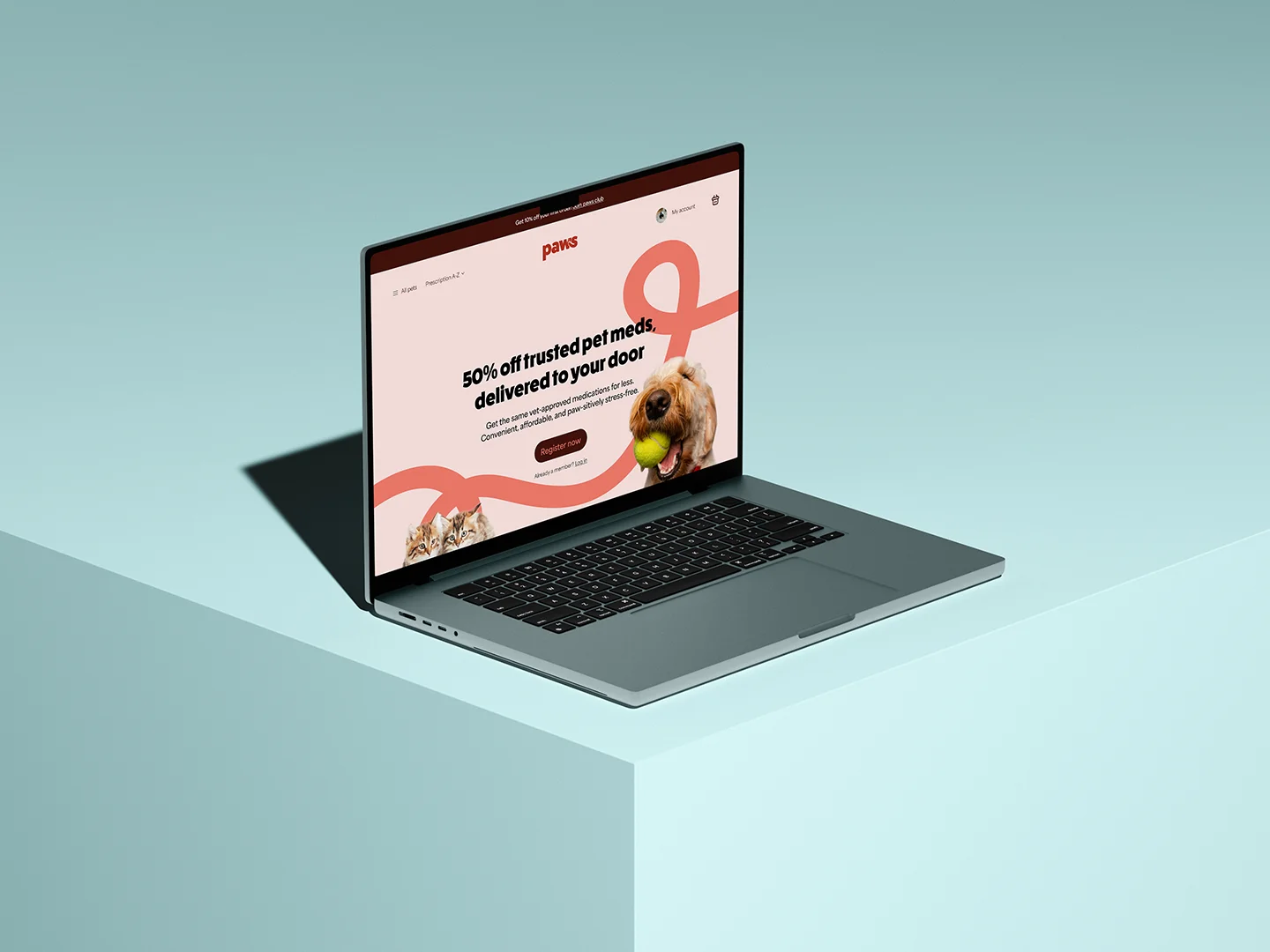
I created a basic homepage and product page with the design system and presented it to stakeholders, which they loved. This was huge because in the later stages of the project, it made feedback much more useful, since it was framed around the actual user journey or action rather than aesthetics.
Creating the user flows
Collaborating with our developer and the vet, we laid out the user journey for:
A user adding a new pet
A user adding a POM-V product to the basket
A user adding an NFA-VPS product to the basket
A user adding a non categorised retail product to the basket
A user assigning a pet to a prescription
A user adding a prescription to an order
Register/log-in flow
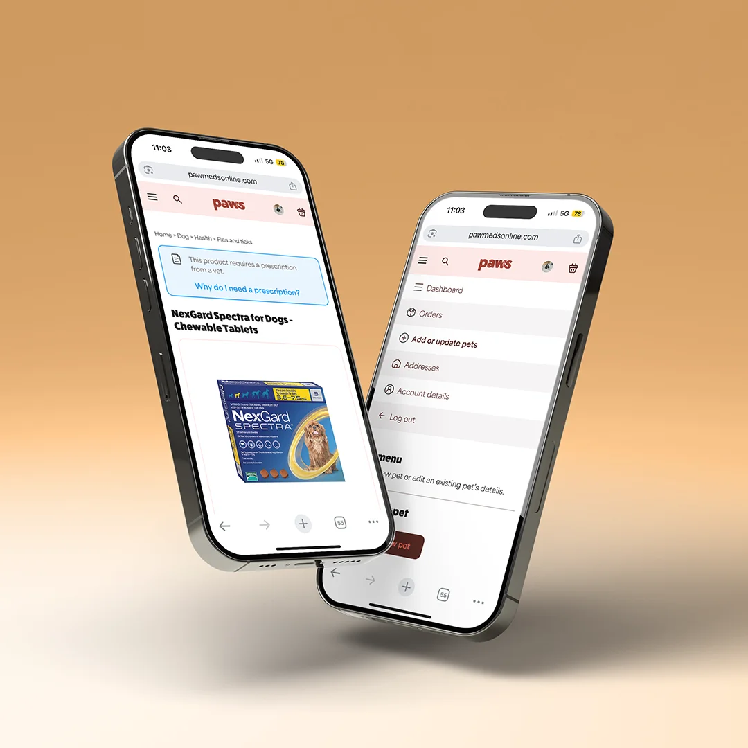
I also figured out how we would handle edge cases for these flows, such as when a user adds a POM-V product and an NFA-VPS product to the same basket, when a user wants to assign two POM-V products to two different pets, amongst others.
We had to make sure to follow GPhC regulation throughout this process - getting this wrong could mean very real consequences to the pharmacy, so collaborating with the veterinarian on parts of the flow we were unclear on was crucial.
We’ve got through the ‘messy middle’, and the website is close to launch now - my Figma documents are with the developer who is implementing them to the website. We also had sync meetings every Monday with our developer and veterinarian, which was a great way to make sure the project was staying on track.
Prototype
Here I showcase part of the prototype I presented: the product page, basket, assigning a pet, uploading a prescription, and checking out.
This prototype shows the user adding a POM-V product, NFA-VPS and a general sale product, since they are all handled differently.
POM-V requires a pet to be assigned and a prescription to purchase
NFA-VPS only requires a pet to be assigned
General sale products don't require either
I included all three to show management how the website would handle all scenarios. It also covers the edge case where a user has to add a prescription for some items in their basket, but not all.
Project outcome
I created a brand identity that feels like us, and speaks to our target audience
I created user journeys for a difficult task that keeps friction to a minimum, and a website prototype that I handed to the dev team. Once the project is live, I am going to monitor these key flows, and adjust them accordingly.
Reflection
I really nailed my brand identity process this project, which I have took into later projects with great success
the design system was really valuable in keeping the product consistent, even when we had to put it on hold for 6 months. I jumped straight back in after the pause
I could have improved the tokens by using semantic tokens as well as primitive - I noticed in certain flows, like the prescription assigning, that I was using lots of containers, but they weren’t a component. This meant I had to check what the stroke colour of my containers were, instead of just looking for a semantic token like 'border-default' in the variables.
This project was lots of fun!